Telco e-commerce Product 2020-2021

Reinventing MASMOVIL’s purchasing flow
Masmovil.es is a telecommunication ecommerce platform selling a series of products and services that increase in complexity every year by adding new types of product combinations and promotions.
The platform lacked a clear and scalable way of building and purchasing complex product packages to suit the user’s needs, with users already having trouble understanding the product offer and conditions, which resulted in a high number of abandoned carts.
I redefined the user flow and improved the purchase funnel, allowing users to combine products easily, and prioritizing the most essential information for clarity and trust.
Role
Team
Timeline
Product designer
Development team
Product manager
6 months
Responsibilities
Discovery, Research, Low and high-fi wireframing, Prototyping, aligning with business needs, final designs and handoff
Analysis
The starting point was to improve the purchasing flow in order to increase online conversion, lowering the call ratio, and improving the checkout dropout rate.


The preliminary research through surveys, analytics, and previous user tests revealed several key insights:
• The total dropout rate of the checkout was 95%
• 64% of users entered the checkout process “by accident”, seeking to customize their bundle.
• 92% of users expressed highly positive attitudes toward configuration/customization of bundles.
• 33% of users sought predefined plans, while 66% preferred choosing the products that adapt to their needs.
• 72% of users would call in case of any questions or issues.
• If a company does not offer what the user is looking for, they will search for another provider.
Moreover, in a highly competitive environment, the platform needed to provide sufficient business-level flexibility to allow for more products and new promotions to be added continually.
“I finish the purchase by phone because the offered bundles don’t exactly match what I am looking for”

Pain point
User personas
The archetypes of users I identified during the research are essentially classified by their level of digital proficiency, product knowledge, and purchasing needs. Having user personas will help us stay focused on potential user frustrations and issues, supporting design decisions.
For this project, we aim to concentrate on users who are not satisfied with predefined packages, need more than one product, and struggle to find what they're looking for.

Problem statement
User stories help us define the main goal for the user:

User story
As a family man, I want a place where I can review and customize my bundle so that I can caltulate and evaluate the final price before committing to purchase.”
In this way, I wanted to redefine the flow to include a place where both users who would buy through the phone and users who would buy online could have a low commitment option to check different product combinations and promotions.
How could we better help users customize and understand their bundle?
Ideation
User flow
Before diving into ideation, I redefined the main user flow:

Architecture information
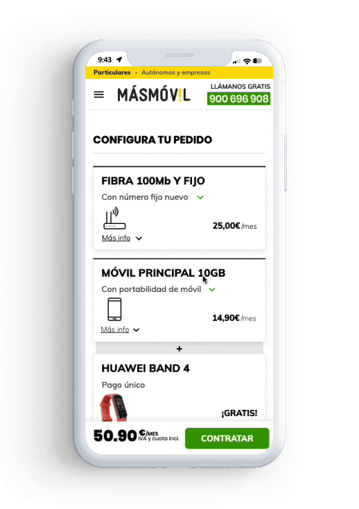
I then worked on a very basic Architecture Information to help map the content and understand what information should be shown on which step. In this regard, Behavioral Design techniques show that it’s very positive to repeat the most important information that the user will need, such as having free installation or how fast you’ll have it up and running.

Sketching
Next, I created a series of quick sketches, exploring different ideas on how to approach this new step in the flow.
I quickly shifted to mid/high-fidelity wireframes, since considering the complexity of the information and the interactions was a high priority, focusing on the details, the information hierarchy, and starting to work with the Styleguide.

Prototyping
Once I had multiple versions, it was key to test with potential users to validate ideas and hypothesis that came up during the design process. I translated my designs to Axure so that I could work with conditional logic and represent a situation as realistic as possible.

For this prototype, I focused on the 3 main use cases:
Play
For users who are not sure yet about the plan they want to buy, and those for whom price is important. It allows them to quickly add or remove options, discover promotions, and evaluate the final price, as well as save their selection for later.
Discover
For users who already have in mind the product they want to get, but find out we have promotions and products that might interest them.
Decide
For users convinced and ready to purchase. We provide information to address their main concerns about the subscription and installation process (FAQs). We offer 'nuggets' of information to clear up the key purchasing barriers (installation, contract duration, etc.), and clarify the path forward (button copy).

Testing
User testing should always be approached with humility. It is where we will identify our major flaws and confirm our hypotheses.
I conducted an iterative design process with 2-3 rounds of user testing, learning something new in each round regarding information architecture, visuals, page structure, or the copy used.
From the beginning, users had very positive feedback on this new step compared to the previous flow, and some of them expressed their preference for online purchasing, which made us trust we were going in the right direction.
Key learnings
Simplifying decision making for users
The initial hypothesis that this new step should be a place where you could change the main plan was incorrect. At this point in the flow, the user has already made a decision and is close to making a purchase. Modifying the initial plan added too much complexity to the process.
Collapsing and minimizing information
Technical details, such as the router model, are distracting to users. Additionally, including too much information made it difficult to visualize all products, especially on mobile devices. I resolved this by collapsing the information with a 'show more' option.
Fixing copy
Some texts were not clear enough, like 'add more lines,' which lacked context. Users expected to enter their mobile phone number instead of adding another mobile plan.
After fixing the most important issues by making the cards smaller, improving the hierarchy, and changing the structure to make better associations between elements, the test results were very positive, greatly improving usability and understanding for our last round of testing.

Results: Users don’t expect to arrive at the new “summary” step, but the response is very positive. They find it easy to add mobile plans and select GB, even though the free SIM deal is confusing.
100% task success
Task: Select plan + add 2 extra mobile lines
Play

Results: Users find it very easy to add mobile phones and devices, but don’t fully understand the TV deal.
100% task success
Task: Add a device for the main mobile line + add Television
Discover
Decide
Results: Users thoroughly review the page before completing the purchase and understand what they have added. They actively seek and appreciate the FAQs and the “Save for later” button. They find it a bit challenging to locate the sticky “purchase” button and the portability switch. (though is not a significant issue as it can be adjusted later on)
62% task success
Task: Review details, change portability + proceed to checkout
Impact
After implementing this new step, online purchases doubled, and sales through the website greatly improved, helping the company achieve its ambitious goals. For months, MÁSMÓVIL was number one in online sales among all the brands within the company.
For users, the user tests revealed they enjoyed the experience, and it felt like we were turning a frustrating situation into something positive.

Learnings
• Working with complex information while trying to keep things simple and persuasive was very challenging.
• Collaboration with development in this project was crucial to achieve an outcome that honoured the design and offered the best user experience, specially in mobile devices.
• Having to scroll up and down while adding things I believe it is one of the weak points of the final design.
• If I had more time, I would experiment with breaking down the actions into 'steps,' creating a more engaging experience and reducing cognitive load for the users.